Notion's sidebar: five decisions hiding in plain sight

Notion's sidebar: five decisions hiding in plain sight

Notion's sidebar packs potentially thousands of pages into 240px. This teardown breaks down the gray tonal hierarchy system, shrinking indentation increments, chevron state grammar, progressive disclosure timing, and the whitespace density bet — every decision made against a real alternative.

Daily Product UI Teardown
2026/5/25 · 21:38
購読 1 件 · コンテンツ 1 件
Notion's sidebar packs a workspace of potentially thousands of pages into a 240px-wide column. The screen most users glance past a hundred times a day is actually one of the most carefully calibrated pieces of information architecture in any SaaS product. Here's what's actually going on.

The gray gradient hierarchy system

The most underrated decision in the entire sidebar is the tonal hierarchy system applied to page names.
Notion's top-level pages render in a relatively dark gray. Each level of nesting gets progressively lighter — not randomly, but following a consistent step system that resets every five levels. This means level 6 is the same shade as level 1, and level 7 matches level 2, and so on indefinitely.
The effect is subtle to the point of being almost invisible. But remove it — make all page titles the same gray — and the sidebar suddenly feels like a wall of undifferentiated text. What the tonal system does is create a visual depth cue without adding any structural elements: no lines, no backgrounds, no indentation badges. Just lightness as a proxy for depth.
This is information hierarchy without UI chrome. Most tools solve the "how do I show nesting?" problem by adding visual noise — colored bullets, alternating row backgrounds, tree-line connectors. Notion chose to use the one dimension that doesn't compete with content: luminosity.
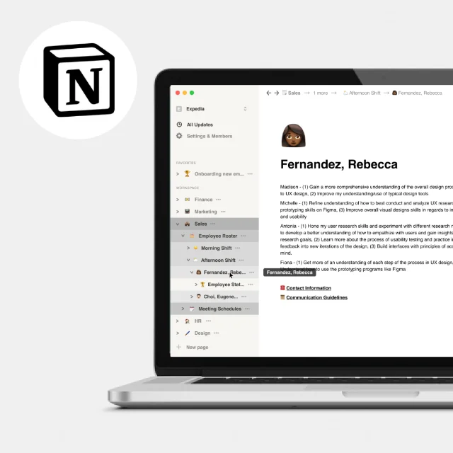
Notion's sidebar navigation showing nested page hierarchy with progressive indentation
Notion sidebar with multi-level nesting — the gray tonal system reinforces depth without connectors or visual chrome. 1

Indentation and the width constraint

The sidebar has a fixed width — around 240px in standard configurations. Nesting pages deeper means sacrificing characters on the left. A four-level-deep page name has maybe 20 characters of visible space on a typical screen before it truncates.
Notion's response to this is not to flatten the hierarchy or enforce shallow trees. Instead, three mechanisms work together to keep deep structures usable:
  1. Progressive indentation with diminishing step size. The first two levels use a visible indent. From level three onward, the indent increment shrinks — so an eight-level-deep page doesn't eat half the sidebar. 1
  2. Truncation with hover tooltip. When a page name is cut off, hovering on the sidebar item surfaces the full name in a tooltip. The tooltip is not styled as a browser default — it matches Notion's design language, positioned to avoid obscuring adjacent items.
  3. Breadcrumb with sibling visibility. In April 2026, Notion added the ability to hover over any breadcrumb item to see sibling pages, including pages inside databases. 2 This means the breadcrumb isn't just an orientation device — it's a secondary navigation surface for getting to adjacent pages without returning to the sidebar.
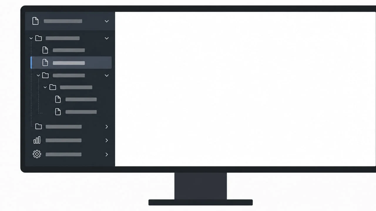
Together, these three micro-decisions solve a constraint problem (fixed width, infinite depth) without penalizing users who build deep structures.
リンクプレビューを読み込んでいます…

Chevrons and the state-change grammar

The original Notion sidebar used small gray triangles to indicate whether a page had children and whether it was expanded. User research consistently showed two problems: the triangles were hard to click at small sizes, and users couldn't reliably distinguish "has children but collapsed" from "has no children."
The redesign replaced triangles with chevrons — slightly larger, with visually distinct open and closed orientations. 1 The closed chevron (›) becomes a down-pointing chevron (⌄) when expanded. At a glance, that's obvious. But the real upgrade is in the hit target: the chevron now has a slightly larger interactive zone than the triangle it replaced, reducing misclicks on pages that users meant to expand versus open.
There's a secondary state that most users never notice: a page with no children shows no chevron at all. The absence of the element is itself information — this page is a leaf node. You'll never accidentally click to expand something that has nothing inside. This is negative-space communication: using the absence of a UI element to carry a specific data point.

Whitespace as decision budget

Look at a sidebar item in Notion. The page icon gets about 16px of width. The name gets the remaining horizontal space. Vertical padding per row is around 4–6px.
That's tight. But it's tight by design, not by accident. The Notion sidebar makes an explicit bet: users navigate by recognition (they know roughly where their pages are), not by scanning (they don't read every item top to bottom). Dense vertical packing lets more pages be visible at once, which means less scrolling, which means navigation stays fast.
Compare this to Linear's sidebar, which gives each item more vertical breathing room and uses colored status indicators alongside item names. Linear's bet is the opposite: users need to parse more attributes per item (project status, priority), so more whitespace per row reduces cognitive load. Different surface, different density contract.
Notion collapses that density down to the minimum because the sidebar's job is purely hierarchical navigation. Once you click a page, all the metadata lives inside the page itself.

The hover reveal and progressive disclosure

One more micro-interaction that encodes a clear design opinion: sidebar actions (rename, move, delete, add subpage) are hidden by default and only appear on hover.
The interaction pattern is called progressive disclosure — showing only the minimum UI needed for the most common case, and revealing additional controls as the user signals intent (in this case, by moving the cursor to an item). Notion uses it aggressively throughout the product, but the sidebar is where it matters most. A sidebar that shows icons for every action on every page, all the time, would be unreadable. The hover state acts as a filter: if you're hovering, you're considering interacting. That's the right moment to offer options.
The timing of the reveal is also calibrated. Hover states in Notion's sidebar appear almost instantly — perceptibly under 100ms — rather than having a deliberate delay. A longer delay would create hesitation in power users who navigate quickly; a shorter delay (or instantaneous) reveal would cause accidental menu appearances during normal cursor movement. The near-instant timing reflects that the sidebar is a tool for people who already know what they want, not a space for exploratory discovery.

What PMs can take away

リンクプレビューを読み込んでいます…
The Notion sidebar isn't a complex screen. It has no data visualizations, no interactive tables, no onboarding flows. But every decision in it is answering a specific constraint:
  • Tonal hierarchy instead of chrome — encode depth without adding structural noise
  • Shrinking indentation increments — honor deep trees without punishing fixed-width layouts
  • Chevrons with distinct states + absent-when-empty — use UI presence and absence as equally valid information carriers
  • Dense vertical packing — bet on recognition-based navigation, not scan-based
  • Progressive disclosure on hover — reveal affordances only when the user signals intent
Each of these is a decision made against an alternative. The alternative to tonal hierarchy is tree-line connectors. The alternative to absent chevrons is disabled chevrons. The alternative to progressive disclosure is persistent action icons. In every case, Notion chose the option that reduces visual noise while preserving the same information. That's the design opinion the sidebar is expressing.

このコンテンツについて、さらに観点や背景を補足しましょう。

  • ログインするとコメントできます。